PROJECT 001 — BRAND IDENTITY / WEB DESIGN
Luma Coffee
One café. Two moods. A connected brand and digital experience.
A fictional café concept exploring two moods—golden-hour warmth and city-light intimacy—through brand identity and web design.
Industry
Food and Beverage
Location
Semarang, Indonesia
Project Type
Self-Initiated Concept
Year
2026
01 – THE CONTEXT
One Place, Two Moods. One Cohesive Identity.
The Concept
Luma Coffee is a self-initiated café concept set in Semarang, Indonesia. Designed for young adults looking to gather, work, or unwind, it imagines a welcoming space where golden-hour views transition into the glow of city lights.
The Design Challenge
The challenge was to express these changing atmospheres through one recognizable identity, then carry that character into a clear, cohesive website.
Project Scope
Brand Identity / Brand Applications / Responsive Web Design
02 – THE CREATIVE IDEA
One Place. Two Faces.
Inspired by lumen, the idea of light became the foundation of Luma’s identity—a café with two distinct moods, connected by one familiar character.
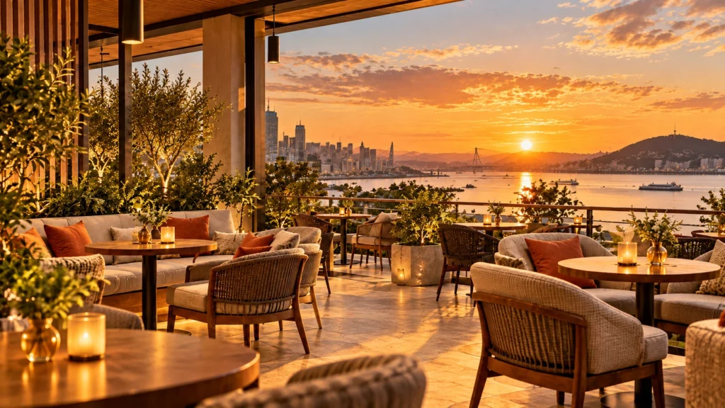
Golden Hour
Warm. Cozy. Unhurried.
A welcoming atmosphere shaped by sunset tones and the ease of late afternoons.
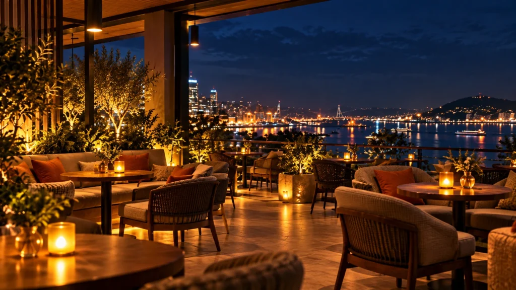
City Light
Intimate. Cozy. Connected.
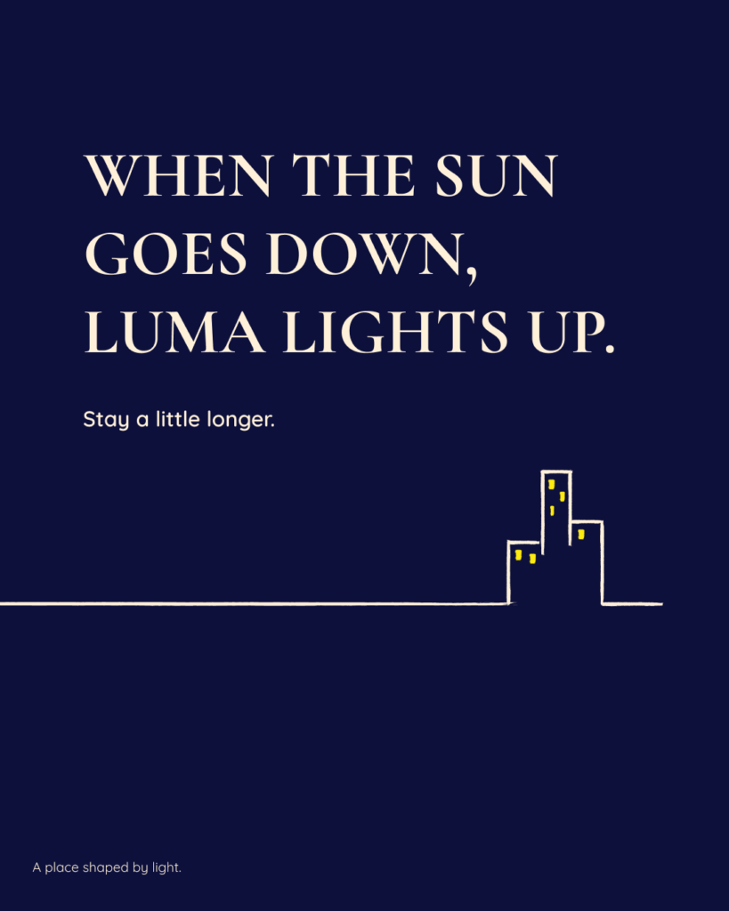
A quieter atmosphere shaped by deep navy tones and the warm glow of evening lights.
A shared wordmark, horizon-inspired graphics, and a continuous orange accent bring both moods together as one recognizable brand.
03 – VISUAL IDENTITY
A visual language shaped by light.
Luma’s visual identity brings its two moods together through expressive typography, horizon-inspired graphics, and a shared accent of sunset orange.
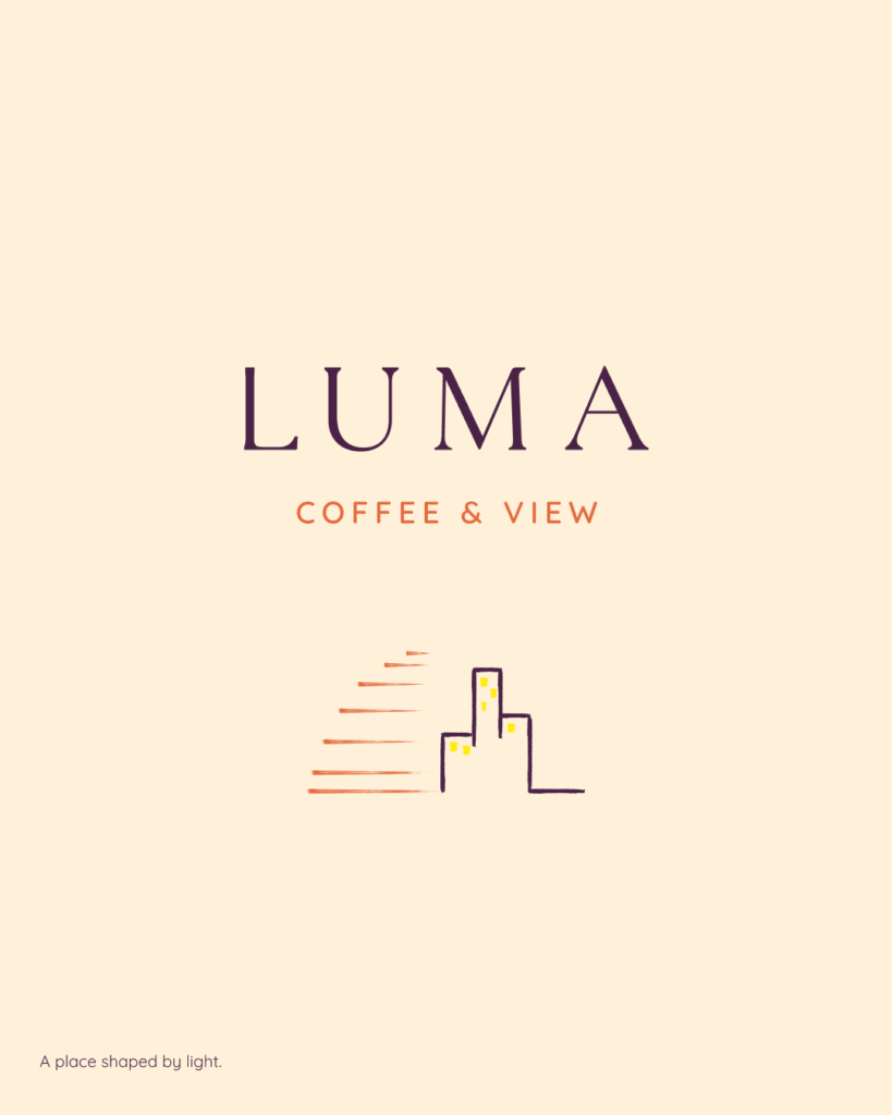
Primary Wordmark
Wordmark
Built from Cormorant Garamond and refined through custom letterform adjustments, the wordmark gives Luma an elegant yet approachable character.
Cormorant Garamond – Customized
Secondary Mark
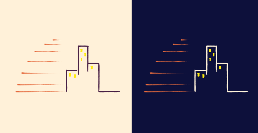
Inspired by sunset horizons and glowing skylines, the Golden Hour and City Light marks express two moods within one cohesive identity.
Color, shaped by atmosphere.
Luma’s visual identity brings its two moods together through expressive typography, horizon-inspired graphics, and a shared accent of sunset orange.
Cream – Primary Field
#FFF1D9
Golden Hour
Warm / Ease / Opennes
Plum – Supporting Tone
#4A2246
Navy – Primary Field
#0D103B
City Light
Intimacy / Comfort / Connection
Cream – Light Contrast
#FFF1D9
Shared Accents
Small details that connect both moods.
Sunset Orange
#E56A3D
Connecting Accent
Yellow
#FFEB0F
Light Detail
TYPOGRAPHY
Character meets clarity.
Cormorant Garamond brings an expressive, elegant character to Luma’s headlines, while Quicksand keeps supporting text friendly and easy to read.
DISPLAY / HEADLINES
A Place Shaped by Light.
Cormorant Garamond
Expressive headlines with an elegant character.
CODY / UTILITIES
A welcoming space to gather, work, and unwind.
COFFEE / NON-COFFEE / SNACKS
Quicksand
Friendly supporting text with everyday clarity.
04 – BRAND APPLICATIONS
Bringing Luma into everyday moments.
From takeaway cups to café signage and social content, Luma’s identity carries a consistent character across physical and digital touchpoints.
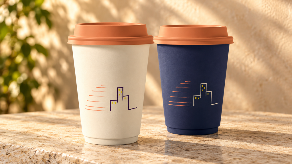
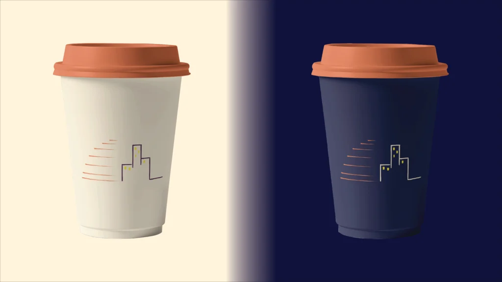
Takeaway Cups
Two moods, connected through a shared wordmark and sunset-orange accent.
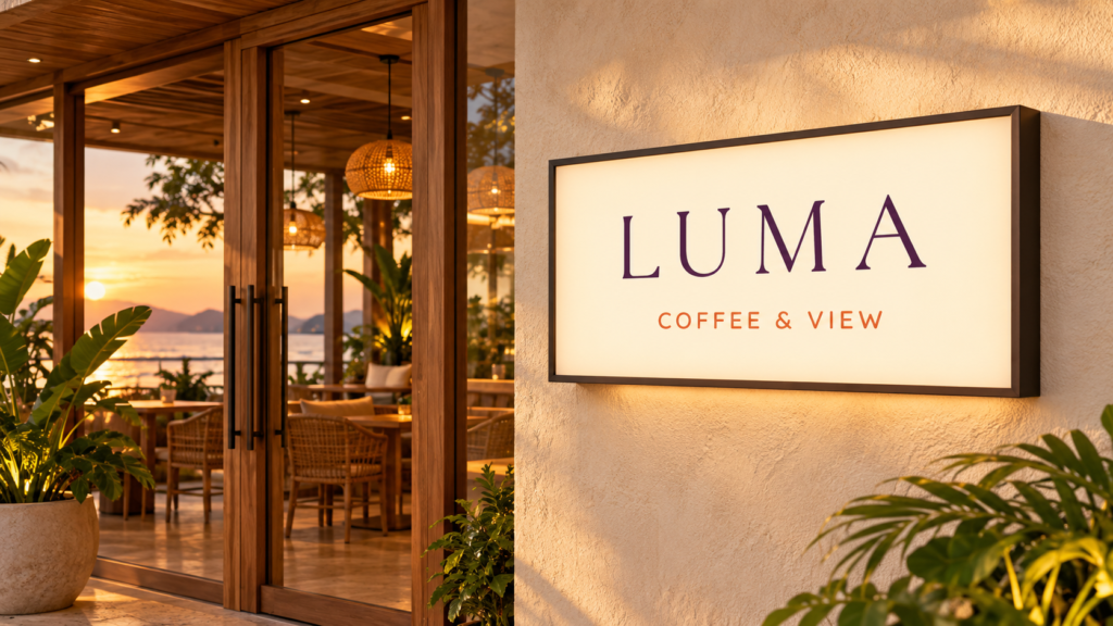
Café Signage
A recognizable presence that brings Luma’s identity into the physical space.
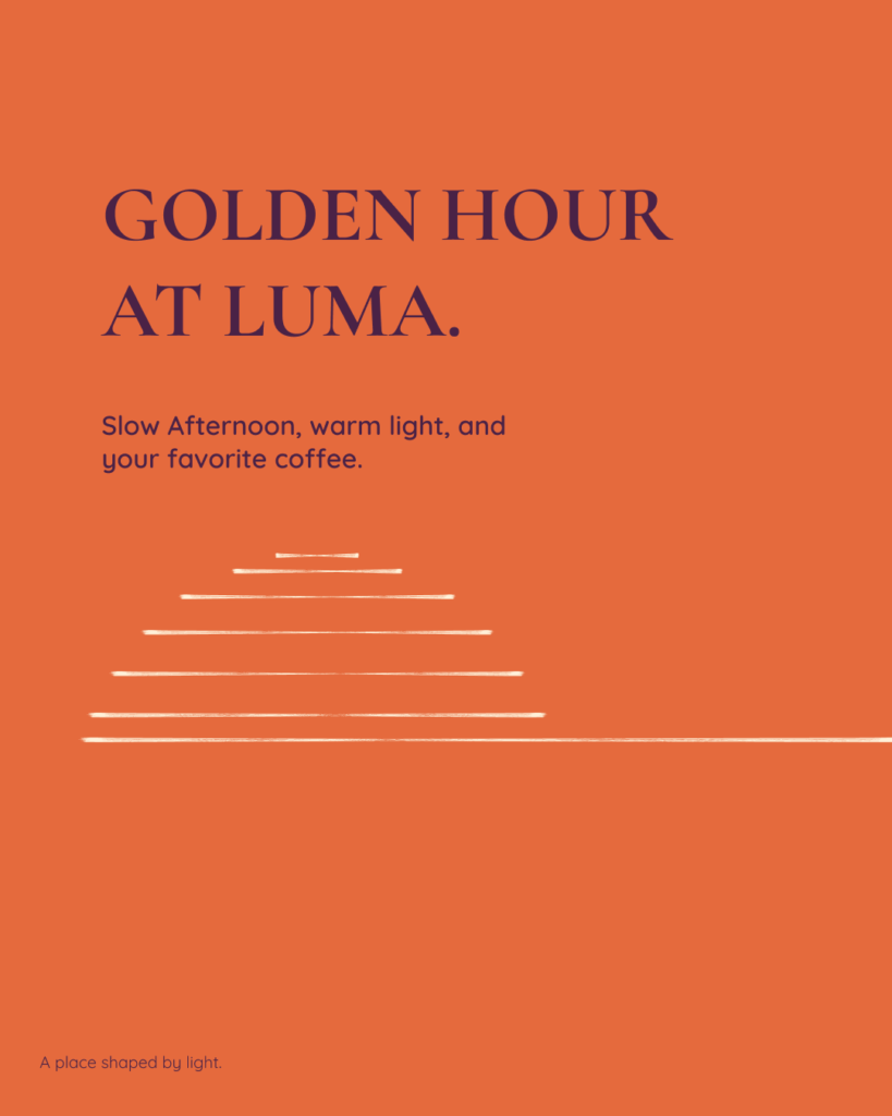
Social Media Content
Golden Hour and City Light come together through a connected three-post composition.
05 – DIGITAL EXPERIENCE
From atmosphere to digital experience.
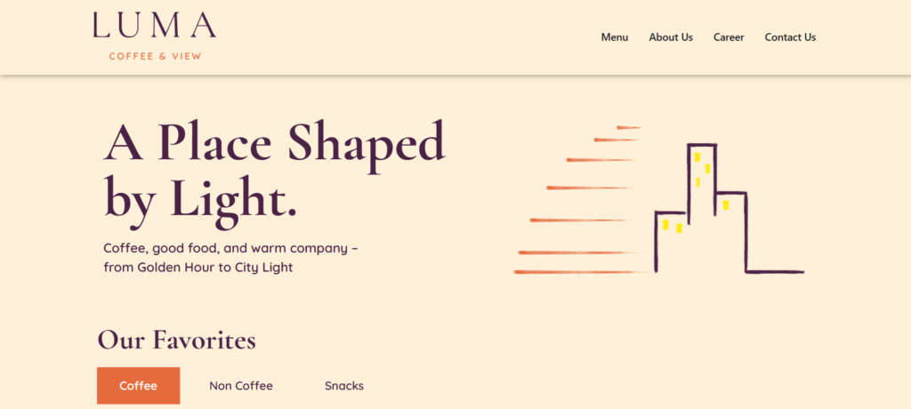
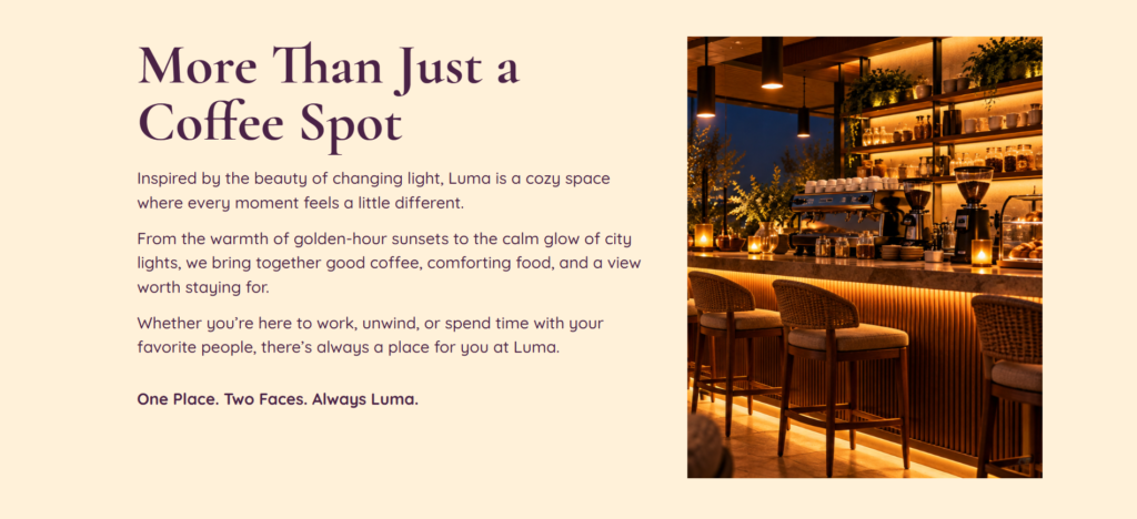
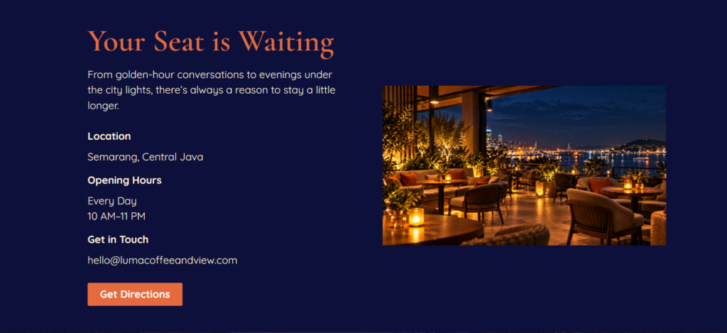
Luma’s identity extends into a responsive one-page website, moving from golden-hour warmth to city-light intimacy through color, imagery, and a clear content flow.
A changing atmosphere
Warm and dark sections carry Luma’s two moods through one continuous page.
Golden Hour / About Us
City Light / Contact
Have a story worth translating?
Let’s bring your business’s character into a cohesive brand identity and digital presence.